Mode breakdown
Why a clean logo can still fail in reverse
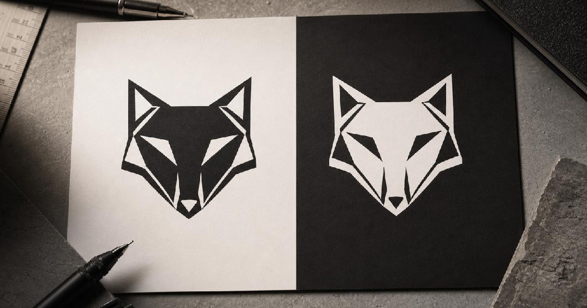
Dansky’s video is built around a problem that catches a lot of beginner designers off guard: a logo can be perfectly fine in black on white, then look subtly wrong the moment you reverse it. The shapes are the same. The file is the same. But the visual weight is not.
That is the useful lesson here. A reversed logo is not just a color swap. Depending on the structure of the mark, details can feel tighter, smaller, or more crowded once they sit on a dark background. In Dansky’s example, the eye, mouth, and character spacing all read differently after the logo is flipped to white on black. None of those parts were technically changed, but the reversed version still felt less open.
For logo designers, that is where the real work starts. If you only compare dimensions, you can miss the problem entirely. If you compare how the mark reads at a glance, the issue becomes obvious.
Negative space changes the way people read the mark
The heart of Dansky’s point is negative space. In a logo with bold block forms, the gaps inside and around the shapes can appear to compress when the surrounding background changes. A dark field can make cutouts and counters feel smaller than they really are. A light field can make the same shapes feel more open.
That effect shows up in the video on the wolf logo’s eye and mouth. Those details are not physically shrinking, but they appear to have less room. The spacing between characters also feels more cramped in the reversed version. For a viewer, that visual shift is enough to change the character of the logo.
This is why Dansky pushes against the assumption that copy-pasting a black logo and inverting it is enough. In practice, some logos need optical correction. Not every mark will need it in the same way, and the creator is careful not to pretend there is one universal amount of adjustment. The point is to look closely and decide what needs to breathe more.
How Dansky corrects the logo in Illustrator
Dansky’s workflow is refreshingly manual. He zooms in, goes inside the grouped artwork, and focuses on the specific areas that feel wrong rather than changing the entire logo at once. For the eye, he avoids moving the spacing in a way that would alter the design itself. Instead, he uses Illustrator’s scale tool to grow the shape from a chosen anchor point.
That approach matters because it preserves the surrounding structure. He is not redrawing the logo. He is making a targeted optical adjustment.
The video also shows a more precise version of that move: if you want control beyond a quick drag, the scale tool can be used with a modifier to enter a percentage. Dansky mentions a rough range rather than a fixed number, then emphasizes that the best result is still the one that looks right on screen. That is the editorial value of the clip. It does not pretend the fix is purely numerical.
He applies a similar eye to the mouth area, nudging the gap so the form feels closer to the original balance. The changes are small, but they are meant to restore consistency between versions. The goal is not to make both colorways mechanically identical. The goal is to make them feel equivalent to a viewer.
When live text becomes outlines, spacing gets more hands-on
The second half of the tutorial shifts from isolated logo details to letter spacing. Dansky points out a key limitation: if text is still live, tracking can handle the spacing across the whole word. But once the text has been converted to outlines, that global control is gone.
At that point, spacing has to be adjusted by hand. In the example, Dansky uses the arrow keys to push individual outlined characters apart in small increments. The method is almost comically simple, but the reason it works is practical: the letters were already converted into shapes, so each one can be moved as needed.
There is a tradeoff here. Manual spacing gives control, but it also takes more time. It is not the fastest option for a casual mockup. It is the right option when the logo needs to hold together across multiple backgrounds and the default spacing no longer feels balanced.
Dansky also notes that professional fonts often have typographically correct built-in spacing relationships, so the gaps between letters are not supposed to be uniform. That means the job is not to make every space equal. It is to make the overall word shape read correctly after reversal.
The practical takeaway for logo designers
The most useful part of this video is not the specific wolf mark. It is the working habit behind it: always check the reversed version as a separate design problem, not a mere output variation.
If the logo has strong internal cutouts, small facial details, or tightly packed letters, the white-on-black version may need different treatment from the black-on-white version. That can mean scaling a detail slightly, nudging a mouth opening, or manually widening letterforms after outlines are created. It can also mean leaving the design alone if the reversal still reads well. The answer is visual judgment, not a preset rule.
For newer designers, that may be the biggest lesson in the clip. Consistency across colorways is not guaranteed by the file format. It is earned by checking how the mark actually reads in context. That is especially true for logos meant to appear on both light and dark surfaces.
Dansky keeps the tutorial grounded in Illustrator, but the broader idea applies anywhere a logo has to survive a background swap: the eye does not care that the source art is unchanged. It reacts to contrast, spacing, and weight. If those shift, the logo shifts with them.
Recommended next
Products & tools
One Mode Digital Media product and one relevant affiliate recommendation selected for this page.
My Browser Knows Too Much
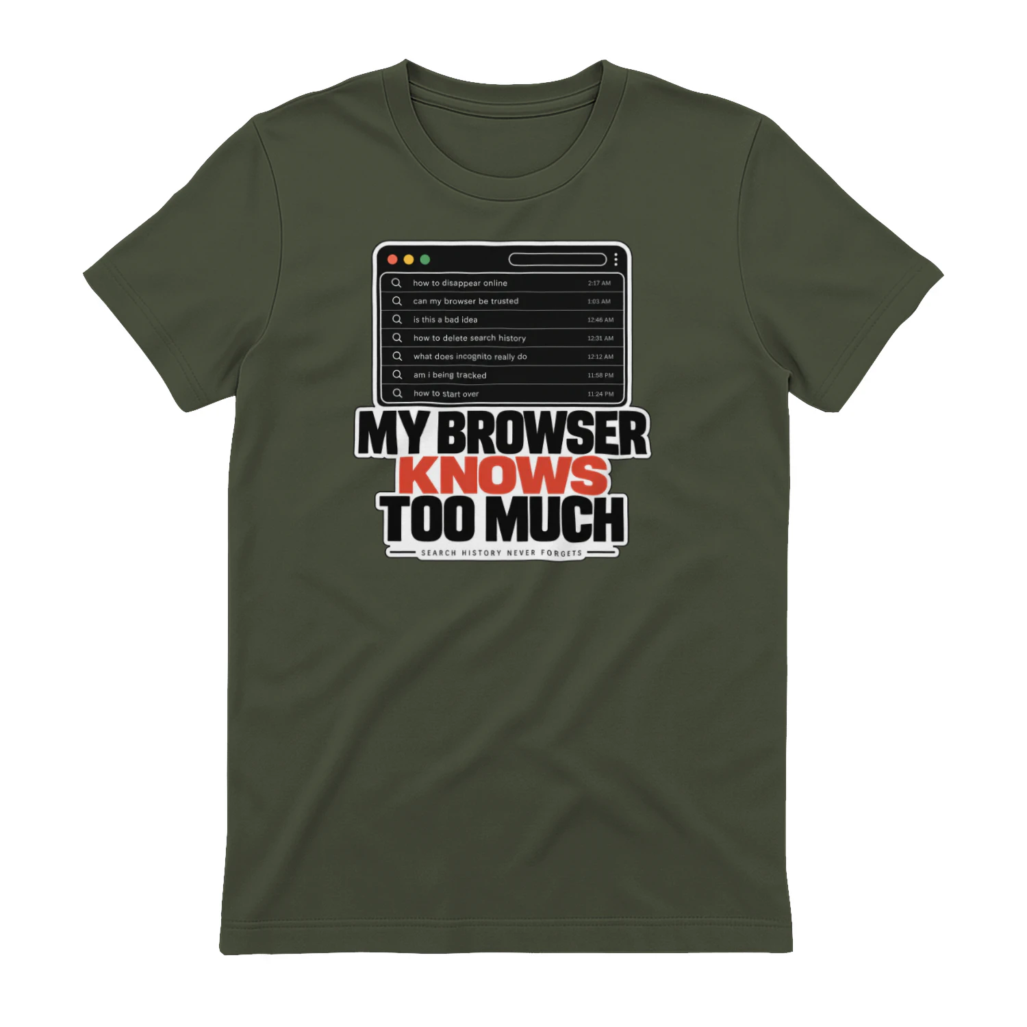
A clean browser-history design built around the uncomfortable truth that your browser may know you a little too well. Equal parts privacy joke and internet-culture commentary, it’s made for heavy web users, tech fans, researchers, and curious minds.
LearnWorlds
Course-building and learning-platform tools for creators and businesses selling education online.