
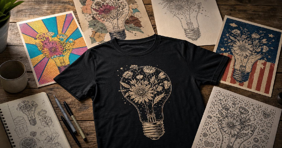
Mode breakdown
Why these Kittl styles matter for shirt design
Detour Shirts’ latest Kittl walkthrough is useful because it answers a common print-on-demand question: what happens when the software, not just the prompt, does most of the visual work? The creator’s point is straightforward. If you are trying to make t-shirt graphics for Etsy, Amazon, or your own shop, Kittl’s built-in styles can turn a short idea into a design that already feels close to a finished product.
That is the practical value of the demo. Instead of treating AI art as a blank canvas, the video treats style presets as design frameworks. You do not have to describe every texture, outline, and layout choice from scratch. In several cases, the style setting appears to bring its own visual language with it: halftone comic shading, paper-cut collage, vector simplification, distressed retro lettering, or doodled background elements. For creators making shirts at scale, that changes the first draft from “concept” to “near direction.”
The video also makes a second point that matters for production work: the same prompt can land very differently depending on the style. That means the style choice is not cosmetic. It is part of the design brief.
One prompt, five very different results
A big part of the walkthrough is the creator’s repeated use of simple prompts. That is deliberate. By keeping the instructions short, Detour Shirts makes the style differences easier to see.
In the pop art preset, a cartoon corgi eating ramen becomes a bright, comic-book-looking piece with halftone texture and a retro feel. The creator did not ask for those extra effects explicitly; they came through as part of the style. That matters if you are designing for shirts because it shows how quickly a basic character idea can become a graphic with a clear audience and mood.
The scrapbook style pushes the same kind of subject matter in a very different direction. The corgi prompt turns into a papery, layered look that feels assembled rather than drawn. Later in the video, the creator tests a more detailed scrapbook collage prompt with flowers, butterflies, old papers, and layered text. The result feels busy in the way scrapbook art is supposed to feel: textured, cut-out, and built from overlapping elements rather than a single clean illustration.
The Dolce Vita preset moves in another direction again. Here the creator is attracted to the vector-based output, which makes color changes easier later. That is a meaningful workflow choice. If a design will need quick revisions for product variations, being able to edit colors without rebuilding the art from scratch is a real advantage. The style itself is hand-drawn and simple, with limited colors and a loose, artisanal look.
Americana Badge is the most obviously retro of the group. The creator uses it for summer-themed graphics and notes the rougher distressed texture and bold condensed lettering. Instead of halftones or paper collage, this style gives you a vintage badge feel with a strong throwback energy. If you are aiming at nostalgia-driven shirts, that built-in texture can do a lot of the work before you touch the typography.
The line-and-doodle style rounds out the set. It uses sketchy background elements, playful marks, and handdrawn-looking scripts. In the demo, a beach-themed design fills out with shells, palm trees, and doodles that the creator did not specify in detail. That can be helpful for a fast concept, although it also means the style may add extra visual noise if your niche needs a cleaner result.
Which styles are easiest to work with later?
Not every style in the video behaves the same once the image is generated. That is one of the stronger observations in the piece.
The creator repeatedly points out that some styles are easier to edit because they generate vector output or because they keep the design simple enough to adjust after the fact. Dolce Vita gets the clearest praise here, since the output is already in vector form and can be recolored more easily. For print-on-demand sellers, that kind of flexibility matters when you want to test variants, shift a palette, or adapt a graphic for different shirt colors.
By contrast, the pop art and scrapbook styles are more about the final look than the editing ease. They can generate strong visuals quickly, but they may be better suited for designs you are ready to use with minimal adjustment. The creator’s enthusiasm for both styles comes from how much visual identity they bring on their own.
Americana Badge sits somewhere in the middle. It is strong for a specific retro aesthetic, but the value is tied to the style’s baked-in look. If you want that exact kind of distressed badge treatment, it is efficient. If you need cleaner typography or less texture, you may have more cleanup work ahead.
The line-doodle style seems best when the goal is a playful, loosely illustrated shirt. The creator’s examples suggest it works well for themes like beach trips or summer wording, but it also relies on the style’s tendency to fill space with extra marks. That can be useful for a fuller composition and less helpful when a minimal layout is the goal.
What the demo says about prompt writing
The most useful lesson in the video is not a secret prompt formula. It is the opposite. The creator keeps the prompts short and lets the preset do the heavy lifting.
For shirt designers, that is a helpful shift in thinking. Instead of trying to micromanage every visual detail, you can start with a clear subject, a rough layout idea, and a few key objects or words. The style preset then supplies the visual grammar. In the examples, that means the prompt does not need to spell out “halftone,” “paper collage,” or “distressed retro type” every time. Kittl already knows the look because the style is baked in.
That can save time, but it also changes the designer’s job. The prompt is no longer the whole design. It is only the starting point.
The tradeoff is obvious: faster first drafts, less control at the beginning. If you are comfortable editing afterward, that is a good exchange. If you need total precision in a very specific niche, the preset might get you part of the way there and then require cleanup in the editor.
The real use case for creators making shirts
Detour Shirts frames these styles as practical tools for people who want to make designs that already look close to what they see in online shops. That is probably the right way to think about them.
These presets are not just for generating random art. They are for narrowing the gap between an idea and a shirt-ready graphic. If you work in print on demand, that can speed up brainstorming, help you test niches, and give you multiple visual directions from the same concept. It can also help you compare styles before deciding which one fits your audience best.
The best fit depends on the job:
- Pop art if you want a loud, comic-style image with retro punch.
- Scrapbook if you want layered, crafty, collage-like textures.
- Dolce Vita if you want editable vector art with a hand-drawn feel.
- Americana Badge if you want distressed vintage shirt energy.
- Line doodle if you want a playful, sketched composition with extra background detail.
The creator’s demo works because it stays close to that decision-making process. It is not selling the idea that every style is perfect for every shirt. It shows how the preset itself can shape the outcome, then leaves room for the designer to refine the result afterward.
Detour Shirts closes by inviting viewers to compare the styles for themselves, and that is probably the most useful frame to take away from the video. The question is not whether Kittl can make a t-shirt graphic. It clearly can, at least for the kinds of examples shown here. The real question is which built-in style gives you the kind of starting point you can actually use.
For print-on-demand creators, that is where speed and judgment meet: choose the preset that already resembles your target market, then edit only as much as the design needs.
Recommended next
Products & tools
One Mode Digital Media product and one relevant affiliate recommendation selected for this page.
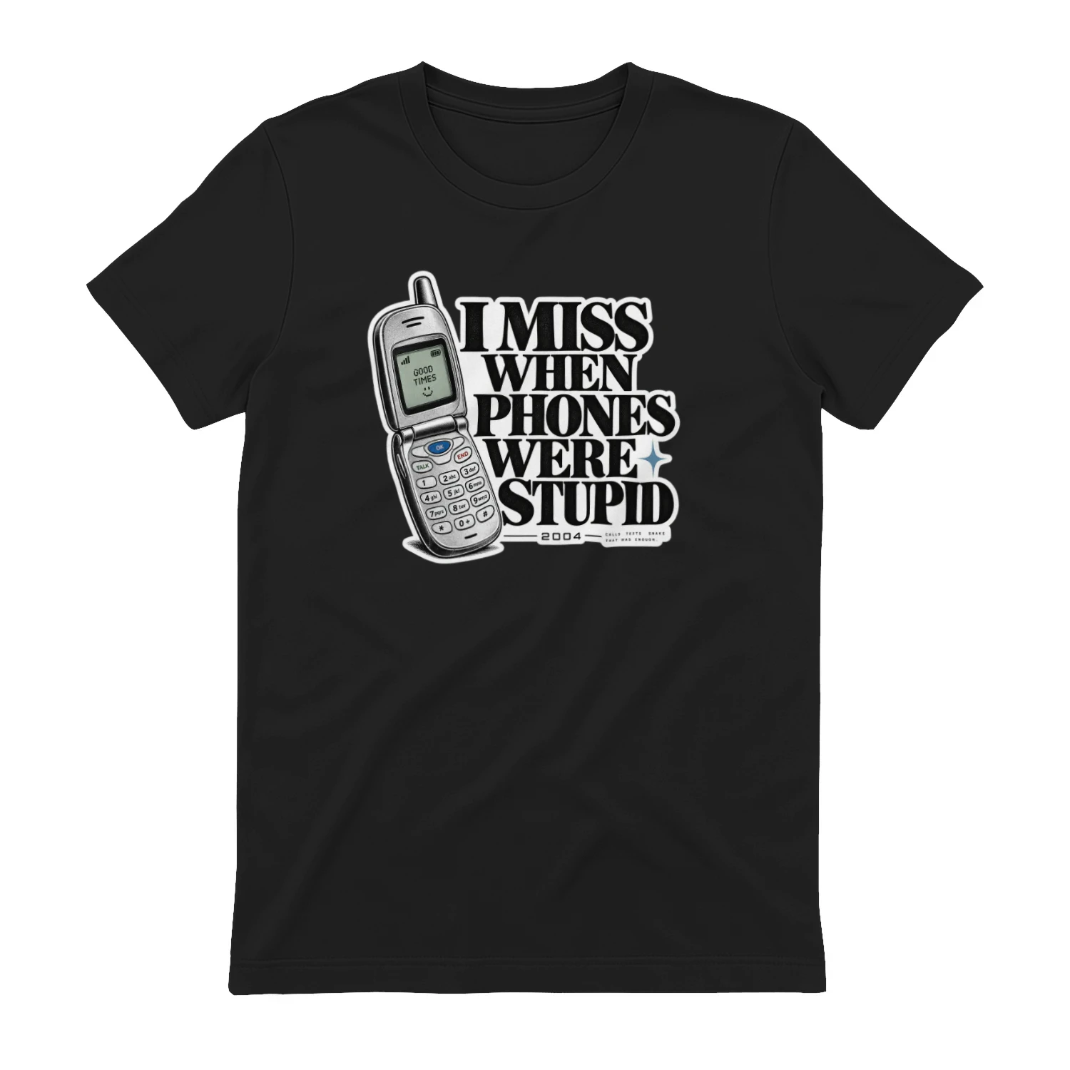
I Miss When Phones Were Stupid
A retro flip-phone design for anyone nostalgic for the days when a phone mostly made calls, sent texts, and played Snake. “I Miss When Phones Were Stupid” brings early-2000s tech nostalgia to a clean wearable piece for digital natives and analog romantics.
Artlist
Music, footage and creative assets for video-first creators.