
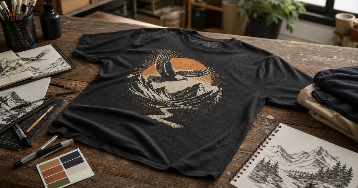
Mode breakdown
What makes a shirt design work before you worry about style
Detour Shirts’ conversation with Drew from Kittl is useful because it treats t-shirt design as a set of practical decisions, not a mystery reserved for experienced artists. The video’s core advice is aimed at beginners and intermediate sellers who are trying to build graphics for print on demand, Etsy, Amazon, or their own clothing ideas. Drew’s point is not that there is one correct formula. It is that a few rules make early designs look more complete, easier to produce, and easier to refine.
The direct answer is straightforward: the strongest basics are to fill the shirt’s visible space, use fewer colors, and keep the concept simple. From there, the more advanced work starts to show up in layout choices like asymmetrical balance and breaking the edges of a shape. Those are not rules you need to force into every design, but they help explain why some graphics feel more intentional than others.
Rule 1: Fill the available space
The first rule Drew emphasizes is what he calls “fill the square.” The phrase is a little shorthand, but the logic is broader than a literal square. On a shirt, the printed area on the torso behaves like a block of space that needs to be used well. If the design sits too small inside that area, the result can feel unfinished or hesitant.
That does not mean every design has to be square. Drew and Juno both stress that point in the video. A circular design can still fill the space well, and a more illustrative layout can still work if it occupies enough of the shirt’s real estate. The point is coverage, not geometry. The viewer should feel like the design belongs to the shirt, rather than floating awkwardly in the middle of it.
This is one reason the examples in the video read clearly at a glance. The type-heavy designs use the available room to make the message legible. The more illustrated designs still spread across the surface in a way that feels deliberate. For beginners, that matters because it removes one of the easiest mistakes to make: leaving too much empty space without meaning to.
In practice, this rule also helps with confidence. When a design fills the area well, you spend less time wondering whether it looks “big enough” and more time judging whether the composition actually works.
Rule 2: Limit the color count
The second rule is to use less color. Drew is careful not to turn that into a hard law, but he makes a persuasive case for restraint. The examples in the video largely stay within two or three colors, and that simplicity does a lot of work. It keeps the design cleaner, makes the artwork easier to manage, and reduces the number of moving parts when you are testing shirt colors.
That last part matters more than it may seem. A design with fewer colors can usually be adapted more easily across multiple shirt backgrounds. If your graphic depends on too many tightly matched colors, your options narrow quickly. If you keep the palette tight, you can test more shirt colors without rebuilding the whole piece each time.
There is also a style reason this advice holds up. Drew points out that vintage illustration looks, silk-screen-inspired graphics, and many popular shirt styles rely on limited color for a reason. Fewer colors can make a design feel more intentional rather than more basic. The look is not about doing less work for its own sake. It is about reducing noise so the main idea reads faster.
For new designers, that can save a lot of frustration. Too many color choices can turn a simple shirt into a series of second guesses. Fewer colors give you a cleaner path from draft to something usable.
Rule 3: Keep the idea simple
The third basic rule is to keep the design simple, and this is where the video becomes especially helpful for beginners. Drew is not arguing that t-shirts have to be plain. He is arguing that the idea should be easy to recognize. A strong shirt usually gives the viewer one main thing to look at, or at most two: text, an illustration, or a pairing of the two.
That kind of simplicity helps in two ways. First, it makes the layout easier to build. Second, it makes the shirt easier to understand. If the message is buried under too many visual ideas, the design starts fighting itself. That can happen fast when a beginner tries to combine multiple graphics, multiple font styles, and a lot of decorative detail in one piece.
The video makes a useful distinction here. Simple does not mean boring, and it does not mean low effort. It means the central idea is instantly recognizable. A quote shirt can still be strong if the type treatment is thoughtful. A graphic shirt can still work if the illustration is clear and the supporting elements stay out of the way.
That is why Drew keeps returning to template-based examples from Kittl. Templates are not a shortcut around design thinking; they are a way to study what already works. For someone starting out, that is often the better path than trying to invent a complicated layout from scratch.
Where advanced shirt designs start to change the formula
Once the basics are in place, the video shifts into more advanced territory. The overall message changes a little here: advanced work is not about adding everything you can think of. It is about introducing controlled complexity.
Two of the clearest advanced ideas in the conversation are asymmetrical balance and breaking the edges. Both create visual interest without making the design chaotic. They also show why some shirt graphics feel more dynamic even when they are not symmetrical in the traditional sense.
Asymmetrical balance makes the layout feel active
Asymmetrical balance means the design does not need to be equal on both sides to feel stable. Instead of mirroring the layout, the composition balances different visual weights against each other. In the examples discussed in the video, one side may carry a larger or heavier element while the other side uses smaller details or spacing to hold the composition together.
This is harder to do than a straightforward centered layout, which is why it belongs in the advanced category. But it also explains a lot of the streetwear and graphic-heavy shirt designs people notice online. The eye moves differently when the layout is uneven in a controlled way. The shirt feels less static.
Breaking the edges adds depth without clutter
The other advanced move Drew highlights is breaking the edges of a shape or frame. Instead of keeping every element contained neatly inside a circle or square, parts of the artwork extend beyond it. That creates layers and a sense of depth.
This technique shows up often in retro-inspired shirts and more dramatic logo-style graphics. It works because it interrupts the flatness of a strictly boxed composition. The design still holds together, but it also feels like it has movement. Used well, that can make a shirt more memorable.
The catch is that edge-breaking works best when the underlying composition already makes sense. If the layout is weak, breaking the border will not save it. That is why the video keeps the advanced ideas anchored to the simpler ones. You need the foundation before the flourish.
A cleaner way to grow as a shirt designer
The most useful part of the video is not any one single rule. It is the sequence. Start by filling the space. Keep the palette tight. Keep the message simple. Then, once that foundation is comfortable, experiment with asymmetry, layered framing, and designs that cross their own boundaries.
That order matters for anyone designing for print on demand or building a shirt catalog. Beginners often want to jump straight to the most elaborate look they have seen online. Drew’s advice suggests the opposite: learn why a shirt reads well before trying to make it look complex.
That approach also makes the design process easier to repeat. A shirt that works because it is balanced, readable, and appropriately scaled can be adjusted into new variations without starting from zero each time. For sellers, that is often where the real efficiency comes from.
The best t-shirt design rules are not really about style trends at all. They are about control. Once you can judge how a graphic fills space, handles color, and balances simplicity with interest, the rest of the choices become much easier to make.
Recommended next
Products & tools
One Mode Digital Media product and one relevant affiliate recommendation selected for this page.
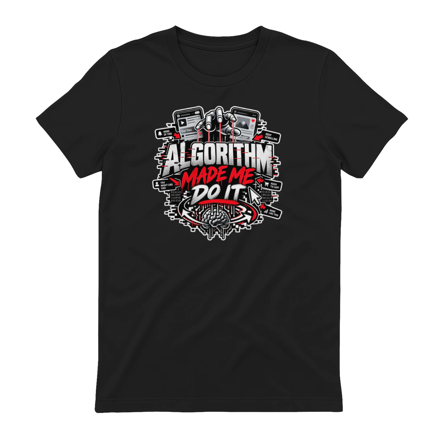
Algorithm Made Me Do It
A bold social-media design built around the excuse we all understand: “The Algorithm Made Me Do It.” With recommendation-feed imagery and digital chaos, it’s made for creators, scrollers, marketers, and anyone whose next click somehow wasn’t entirely their idea.
LearnWorlds
Course-building and learning-platform tools for creators and businesses selling education online.