
Mode breakdown
Why feedback catches the mistakes creators stop noticing
Casey Faris’s review of three creator videos makes a simple argument: the fastest way to get better at editing is to have someone else point out the parts you have stopped seeing. That is the real value of the video, not just the individual notes on Resolve. Faris and Dan are not treating the review like a performance critique. They are showing how outside feedback helps creators spot recurring problems in structure, pacing, and visual design before those problems become habits.
That matters because the mistakes they point out are familiar ones. They are not dramatic technical failures. They are the small choices that quietly weaken a video: an intro that takes too long to get to the point, text that lands where the eye does not want to go, and sections of footage that keep playing after the useful information has already passed. If you edit regularly, those issues can blend into the background. A review forces them back into focus.
Open with the promise, not the warm-up
The strongest advice in the video starts at the top of the timeline. Faris praises one creator’s intro because it gives the viewer a clear reason to stay: it says what the video is about right away and makes the promise early. In practical terms, that means a viewer can decide immediately whether the video is for them.
He also suggests a better version of the same idea: add visual teasers from later in the video over the opening line so the audience can see what is coming. That is a small structural move, but it changes how the intro feels. Instead of relying only on narration, the edit starts selling the experience with footage.
The same principle shows up again in the aviation video review. Faris is blunt about the cost of “getting ready” on camera. If the clip begins with someone hesitating, turning away, or preparing to speak, the audience is already waiting for the real start. His fix is to cut to the moment that actually begins the story. In his view, viewers do not need to watch the setup to understand the setup.
The takeaway is not that every video needs a flashy hook. It is that the opening should answer a basic question quickly: why should I keep watching this exact video? If the answer is buried under extra setup, even good footage has to work harder than it should.
Make text easy to read and easy to place
One of the most useful parts of the review is also one of the simplest: text placement matters more than many beginners realize. Faris points out that text sitting near the edge of the frame feels cramped, especially when it is combined with a background that changes contrast from dark to light to saturated color. His recommendation is practical rather than theoretical: give the text breathing room, keep it away from the border, and use a simple drop shadow when the background competes with the lettering.
That advice works because it is not trying to make the title card do too much. Faris is not asking the creator to redesign the sequence. He is asking for a cleaner fit between the text and the shot. Move the text into a more intentional position, reduce the visual friction, and the message becomes easier to absorb.
He makes a similar point in the review of Jenny’s video, where the ending title uses motion and styling that distract from the tone of the piece. His preference is for clarity over decoration when the design starts pulling attention away from the message. In other words, if the typography is competing with the content, the typography is probably doing too much.
For Resolve users, this is a useful reminder that better text often comes from subtraction, not more effects. A readable font, a centered or balanced layout, a bit of spacing, and a shadow when needed will usually do more for the edit than a more elaborate animation.
Cut the dead air, keep the useful motion
Pacing is the other major theme running through the whole review. Faris repeatedly comes back to the idea that footage should earn its place. If there is no dialogue, no meaningful sound, and no visual development, the section is probably too long.
That is why he pushes back on the driving outro in the Subaru video. The car has already been serviced, the useful steps are done, and the remaining footage mostly delays the finish. His suggestion is to end the edit sooner and summarize the outcome in voice-over if needed. He even says the video could probably be shortened by several minutes without losing anything important.
The same logic appears in the aviation feature, where he calls out stretches of empty space, repeated setup, and clips that show people talking without giving the audience anything to hear. He is especially focused on sound as a pacing tool. If a shot has no useful audio and the visuals are not advancing the story, it should not sit in the timeline just to fill space.
That does not mean every quiet shot is a problem. Faris actually likes the moments where the voice-over and the visuals line up, such as the rain sequence in the aviation video. In that case, the narration sets up an experience and the sound lets the viewer feel it. The shot earns its length because it adds atmosphere and information at the same time.
So the test is not “is this clip short?” It is “what does this clip add?” If the answer is only continuity, the edit may need trimming. If the answer is story, sound, or useful context, it can stay.
What Casey Faris is really teaching about faster improvement
Beneath the specific notes, Faris is teaching a workflow for improvement that many editors could use. Review the opening for clarity. Check text for readability and placement. Remove anything that does not add new information. Then look for places where voice-over, sound, and visuals can work together instead of separately.
That approach is why the video feels useful beyond the three examples. It does not just say “do better editing.” It shows where edits usually get messy and what to do first. Faris also makes clear that this kind of feedback is something he and Dan use regularly with students, which explains the directness of the notes. The goal is not to flatter the creator. The goal is to identify the few changes that would raise the whole video.
For editors working in DaVinci Resolve, the lesson is especially practical because it translates into a short list of habits: open with the promise, simplify text, and cut the moments that do not move the story forward. Those choices do not require a complicated toolset. They require discipline and a willingness to let the edit breathe where it matters and end where it should.
Recommended next
Products & tools
One Mode Digital Media product and one relevant affiliate recommendation selected for this page.
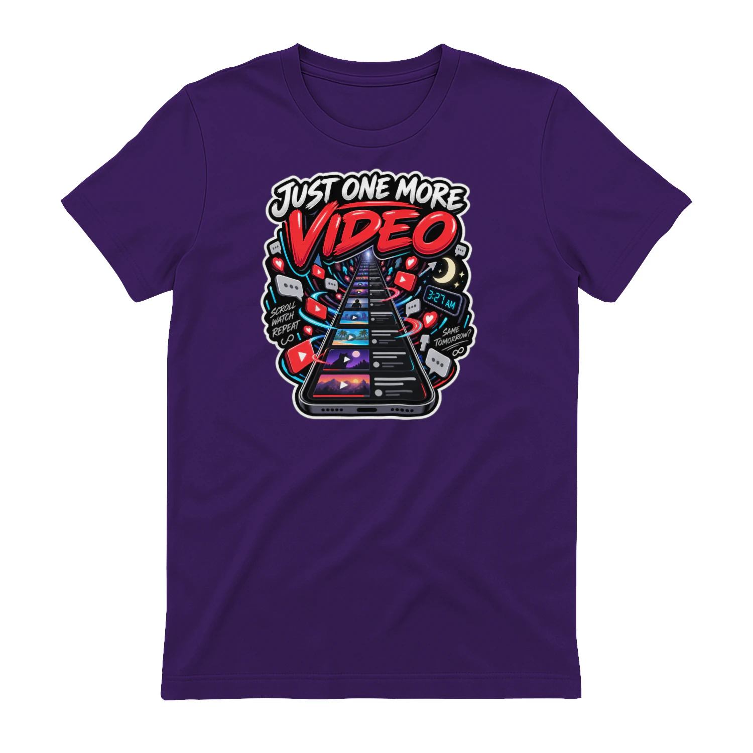
Just One More Video
An endless-scroll design for anyone who has said “Just One More Video” and immediately watched twelve more. The infinite feed artwork is a perfect fit for night owls, streamers, social-media fans, and anyone who knows how quickly one click becomes an hour.
Artlist
Music, footage and creative assets for video-first creators.