
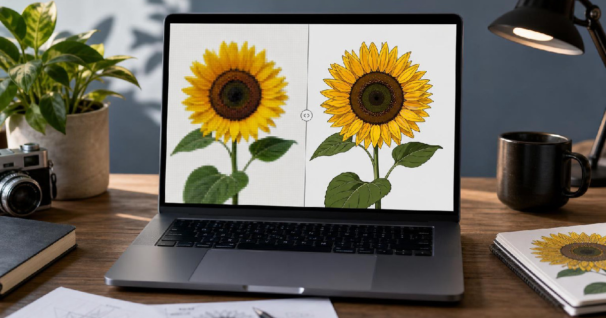
Mode breakdown
Why Image Trace is the fast path to vector artwork
If you need a quick way to vectorize images in Illustrator, Pixel & Bracket’s walkthrough starts with the right premise: Image Trace is often the fastest entry point, but it is not a magic button. It works by converting a pixel-based image into vector shapes that can be scaled and edited, which is exactly why it is useful for artwork that already has strong outlines or simplified color blocks.
That distinction matters from the start. In the video, the creator contrasts a clip-art-style PNG with a cutout dog photo. Both are raster images, which means they are made of pixels, not vector paths. Both can look fine at a normal size and then break apart when zoomed in. But they do not respond to tracing the same way. The clip art image is a better match for a clean, efficient trace. The photo can still be traced, but the result is naturally more complex and less tidy.
That is the practical frame for anyone using Illustrator for the first time: think of Image Trace as a conversion tool, not a quality enhancer. It can reproduce what is already there in vector form, but it does not invent crisp detail that the source image never had.
Choosing a preset based on the image you start with
Pixel & Bracket uses the Image Trace panel to show that preset choice is not cosmetic. It is the first decision that shapes how the trace will behave.
For simple artwork, presets like black and white logo, line art, or a limited-color mode give you a tighter starting point. The video points out that line art is especially useful for single-color outlines, like a signature or a drawing with very clean edges. High fidelity photo, by contrast, is aimed at richer images with more tonal variation. It can preserve more of the original look, but it can also produce a dense trace with many colors and shapes.
The creator’s approach is sensible because it avoids one common mistake: assuming the default preset is the right place to stay. Default black-and-white tracing may be fine for some assets, but not for every image. If the original artwork has a small number of colors, a preset such as three color, six colors, or 16 colors can keep the result closer to the source while still staying manageable.
The bigger lesson is that the preset should reflect the kind of image you brought into Illustrator. A simplified drawing wants a different treatment than a photo. If you start with the wrong preset, you can spend extra time trying to rescue a trace that was headed in the wrong direction from the beginning.
The settings that actually change the result
The part of the process that seems intimidating in the Image Trace panel is also where the useful control lives. Pixel & Bracket focuses on three settings that do most of the work: paths, corners, and noise.
Paths affect how closely the trace follows the original image. More paths can capture more of the image’s shape, but that can also make the result busier. Fewer paths can create a cleaner look, though sometimes at the cost of detail. In the tutorial, the creator notes that increasing paths changed the result the most on the example image.
Corners are the second major lever. Adjusting them changes how sharp or rounded traced shapes become. That is a useful reminder that Illustrator is not just tracing outlines; it is interpreting those outlines. A setting that looks good on one image can make another look stiff or overly jagged.
Noise is the most conditional of the three. Depending on the source image, it may barely change anything or it may help eliminate tiny stray details. The video’s example suggests that noise can hurt more than help if it begins to distort the character of the image. That is a useful tradeoff to keep in mind: cleaner is not always better if the cleanup strips away the shape you actually wanted to keep.
The creator does not treat these controls as fixed formulas, which is the right approach. They are image-dependent. The best result usually comes from making one adjustment at a time and watching what happens, rather than trying to force every trace through the same settings.
Removing the background and committing to vectors
Once the trace looks close, the next step is not optional if you want a usable vector file: expand it.
But before that, Pixel & Bracket shows how to handle the background. Using the abutting method gives the trace the option to ignore a color, which is how the white background is removed in the example. If the background does not disappear immediately, the tutorial suggests selecting it with the eyedropper so Illustrator can treat it as a color to ignore. That turns the trace into a cutout rather than a flat image with a white box around it.
Only after those edits does the creator click Expand. That step converts the traced image into editable vector shapes. Once expanded, the artwork is no longer a live trace preview; it becomes a group of paths that can be edited individually. In the video, that means the traced dog can be opened up and adjusted like any other vector object.
This is the point where vectorizing stops being abstract. You can zoom in without seeing pixels, and you can edit pieces of the artwork rather than being stuck with the original raster file. That matters if you need to recolor parts of the image, refine shapes, or reuse the artwork in a layout that requires clean scaling.
Where tracing works well, and where it stops helping
The strongest part of the tutorial is that it does not oversell traced vectors as identical to the source. Pixel & Bracket is clear that a photograph traced in Illustrator can become a large collection of shapes that resembles the original, but it is still a translation. It is not the same thing as drawing a true vector illustration from scratch.
That difference is easy to miss if you only care about the result at thumbnail size. But it matters the moment you zoom in, edit the file, or try to use the artwork in a more demanding layout. A photo traced with Image Trace may be useful, but it will rarely feel as clean as a purpose-built vector drawing. That is why the creator treats the dog photo example as something to evaluate, not a perfect solution to recommend blindly.
So the real value of vectorize images in Illustrator is not just turning a file into something scalable. It is learning how to judge the source material before tracing it. Clean clip art, logos, signatures, and simple drawings are usually the easiest wins. Photographs can be traced too, but they ask for more patience and a more realistic expectation of what Illustrator is doing.
If you are working in Adobe Illustrator and want a simple starting workflow, this is the one to remember: choose the right preset, adjust the trace settings that actually change the shape, remove the background if needed, and expand only when the result is close enough to keep. That is the shortest route to a vector file that is useful instead of merely converted.
Recommended next
Products & tools
One Mode Digital Media product and one relevant affiliate recommendation selected for this page.
Perpetually Online
A collegiate-style internet culture design for people who practically live on the web. “Perpetually Online” turns constant connectivity into a tongue-in-cheek badge of honor for creators, gamers, streamers, social-media regulars, and professional tab keepers.
Artlist
Music, footage and creative assets for video-first creators.