

Mode breakdown
Why carousel design slows down in Canva
If an Instagram carousel keeps turning into a two-hour project, the problem usually is not Canva itself. It is the number of decisions you are making after you open the app. In Design with Canva’s tutorial, the creator frames that delay plainly: a post that should be quick gets bogged down in font tweaks, color changes, and repeated second-guessing.
The practical answer is not to work harder inside the editor. It is to do more of the thinking before you start. That is the video’s central value. It treats carousel creation as a workflow problem, not a design talent test. The faster path is to prepare the content, search more intentionally, and choose a template that already resembles what you need.
That sounds basic, but it changes the way the rest of the process works. Instead of building a carousel from scratch, you are adapting a structure that already does much of the heavy lifting.
Start with the content, not the canvas
The first tip is also the one most people skip. Before opening Canva, have the written content ready and know which images you need. The creator is explicit about this: if your copy is still unfinished, or you have not gathered the pictures you want to use, you are setting yourself up for friction later.
That matters because a carousel is not a single image. It is a sequence. The cover, the middle slides, and the ending call to action all need to feel connected. If you are still writing while designing, every page becomes a new judgment call. If the content is already set, you can use the template as a delivery system instead of trying to invent the structure at the same time.
The video’s advice here is practical, not decorative. Know whether your carousel is text-heavy, image-led, or a mix. Know which assets need to appear. Once those pieces are in place, you can search for a layout that fits instead of forcing one to fit later.
Search templates by topic and structure
The next step is to use Canva’s template library more deliberately. Rather than scrolling endlessly, the creator recommends searching for the exact thing you want. Typing “Instagram carousel” narrows the library to relevant results. Adding extra terms narrows it further, such as “Instagram carousel only text” when the post does not need imagery.
That search strategy saves time because Canva templates often arrive with a built-in rhythm: a cover slide, a few supporting pages, and sometimes a closing slide. The video highlights that point as a real advantage. When the layout already includes the basic flow, you are not assembling each slide from zero. You are mostly swapping in your own message.
The creator also shows a useful alternative search method: look for the topic of your carousel rather than the format alone. Searching for something like productivity can surface templates with relevant imagery already in place. If you already have copy written and you want a design that uses images, that is a cleaner starting point than choosing a random text-only layout and trying to force pictures into it later.
For readers who make repeated content, this is the main efficiency gain. Search results are not just a source of inspiration; they are a way to filter for the kind of editing you want to do. If you know you want text-only slides, choose templates built that way. If you want image-based pages, look for a design that already uses the kind of framing your own photos can match.
Match the template to your images before you edit
This is where the video gets especially useful. The creator spends time showing that template choice is not just about style. It is about whether your images fit the structure without fighting it.
A template can look great in the preview and still be awkward once you place your own photo inside it. The reason is simple: not every photo replacement is interchangeable. Some designs depend on portrait framing, some need the subject centered, and some rely on a cropped section of the image to preserve the composition.
The tutorial’s best insight here is to check whether your existing image is similar enough to the one in the template. If the design expects a portrait photo, start with a portrait photo. If the original layout has the subject centered, your replacement image should be framed similarly. When the photo roughly matches the template, you can swap it in quickly and keep most of the original design intact.
The creator shows a few ways to make that work: dragging a similar photo into place, adjusting the crop, moving decorative elements slightly, or using a section of a larger image when the full frame would cover text awkwardly. In one example, a close-up photo behind text would have made the design feel cramped. Cropping the image differently produced a cleaner result.
That is the real lesson: a good template is one that accepts your assets with minimal resistance. The less you have to redesign after dropping in your photo, the faster the carousel gets done.
Save the templates that already worked
Once you find a template that fits your workflow, do not rely on memory. The creator recommends starring the design so you can find it later in Canva’s saved content. That is a simple step, but it solves a real problem: good templates disappear in a crowded library fast.
This is especially helpful if you create similar carousels over time. You might not remember the exact search terms you used, and the template could be buried under newer additions. Starred content gives you a shortcut back to a proven layout instead of forcing you to search from scratch every time.
The video also suggests checking the creator profile behind a template you liked. If the font, structure, or visual rhythm worked for one carousel, similar templates from the same creator may give you a consistent look across future posts. That can help your feed feel coherent without demanding a custom design for every new idea.
For anyone trying to publish more often, this is a smart habit. The goal is not to hoard templates. It is to build a small personal library of layouts that already match your content style.
Use the size that fits the feed, not just the editor
The final tip is about presentation outside Canva. The creator warns against defaulting to a square carousel when a portrait format will read better in the Instagram feed. A square cover can appear cropped, which makes the post look less polished before anyone even opens it.
The tutorial points toward portrait sizing as the safer choice and shows how resizing can be handled inside Canva. The key idea is not the menu click itself. It is the habit of designing for how the carousel will appear on the profile grid and in the feed, not just how it looks on your screen while you are editing.
That is where speed and professionalism meet. If the template already uses the right format, and your image choice matches the layout, and you have saved the designs that worked before, the process gets much faster without looking rushed.
Design with Canva’s tutorial is useful because it reduces carousel creation to a set of decisions you can repeat. Prepare the content first. Search with a specific purpose. Match your images to the layout. Save the winners. Use the right size. None of that is flashy, but it is exactly what keeps a simple post from becoming a long afternoon.
Recommended next
Products & tools
One Mode Digital Media product and one relevant affiliate recommendation selected for this page.
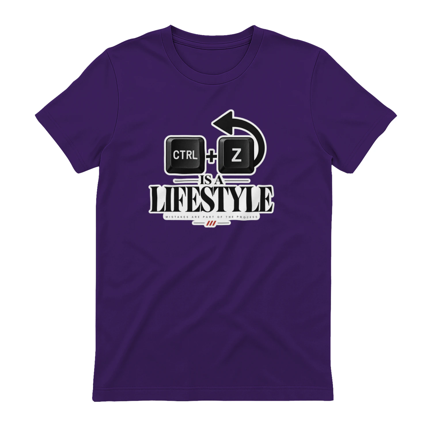
Ctrl + Z Is a Lifestyle
A clean keyboard-shortcut design celebrating the most comforting command in the digital world. “Ctrl + Z Is a Lifestyle” is made for designers, developers, editors, creators, and anyone who believes every mistake deserves at least one undo.
LearnWorlds
Course-building and learning-platform tools for creators and businesses selling education online.