
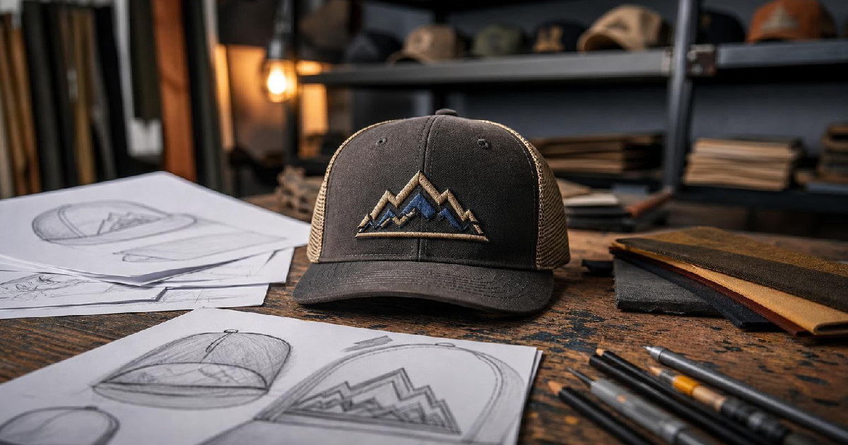
Mode breakdown
Why hat graphics need their own workflow
Detour Shirts’ video is a good reminder that print on demand design is not one-size-fits-all. A hat is not a small T-shirt. It has a curved surface, a tighter printable area, and a shape that can make otherwise solid lettering look off if you paste it in without adjusting for the cap.
That is the practical value of the walkthrough. Instead of treating hat merch like a reduced version of shirt merch, the creator starts from a photo of a real cap and uses that shape as the reference point for the design. The result is a workflow that is less about decoration and more about fit. If the text is wrong for the hat, the design looks wrong no matter how clever the phrase is.
Start with the cap, then build around it
The first move in the video is simple: the creator photographs hats at Target and uses one of those images as the guide. From there, the design is sized to match the hat’s available space rather than a generic product template. That matters because the visible area on a cap is narrow enough that a design can easily become too tall, too thin, or too cramped.
The phrase used in the demo, “cold brew,” is less important than the method around it. The creator adds a headline text layer in Kittl, stretches it to fit the width, and then checks whether the letters sit naturally inside the hat space. When the proportions feel slightly off, the design is adjusted with transform and distort tools so the lettering follows the shape more closely.
That workflow makes an important distinction for print on demand sellers: a design can be readable and still not be ready for a hat. Readability is only the first step. Fit is the second.
Typography choices do most of the work
The video spends a lot of time on font selection, and for good reason. On a hat, the typeface does much of the visual heavy lifting because there is not much room for extra illustration or decorative clutter. The creator uses a slab serif for the “cold brew” example, and the reason is easy to see in the walkthrough: the squared letter endings feel sturdier and better suited to a compact cap graphic than a more delicate style.
The second example, “game day,” goes a different direction. Here the creator opens a title-style font, ungroups the text, and swaps in a glyph for the Y so the letter connects more naturally with the rest of the word. That small adjustment is the kind of detail that can make a design look custom rather than forced.
Just as important, the video shows that the font still may not be long enough to fill the intended space. Rather than giving up and choosing a different phrase, the creator uses outline text and manually stretches the wordmark to improve the fit. The tradeoff is clear: you are not preserving the font untouched, but you are shaping the design to match the cap. For this kind of product, that can be the better choice.
What glyphs and outline text are really doing
If you are newer to Kittl, the glyph and outline steps are the parts worth paying attention to. They are not there for flash. They solve layout problems.
Glyphs let the creator substitute alternate letterforms, which is useful when a standard character does not connect, extend, or balance the way the design needs. In the demo, the adjusted Y helps the word feel more continuous.
Outline text does something different. Once text is converted to outlines, it is no longer behaving like editable live type in the same way. That gives the creator more freedom to stretch, reshape, or space the wordmark so it occupies the hat area more effectively. The downside is obvious: once type is outlined and manipulated, you are no longer working with the original text object in the same flexible way. But for a cap design that needs visual balance, that tradeoff can be worth it.
The creator is careful not to frame the result as a perfect replica of the reference hat. That honesty helps. The point is not to copy a retail product pixel for pixel. The point is to understand how a hat graphic gets its shape and then build something that belongs on a similar surface.
Exporting for hats, not shirts
The export step is brief, but it carries a lot of practical weight. The creator selects the artboard and exports the design while removing the background. That makes sense in a print on demand workflow where a transparent file is often the useful output, especially when the design may be placed onto mockups or prepared for a product listing.
The other thing the creator makes clear is just as useful: these designs were made for hats, not T-shirts. They are too small for shirts and are meant to live exclusively on caps. That boundary matters because it keeps the workflow honest. A design can be successful in one product category and still fail in another if the proportions do not translate.
For sellers, that means the real skill is not simply creating a design that looks good on screen. It is creating one that survives the product it is meant for.
The bigger lesson for print on demand sellers
The value of the video is not limited to the two examples on screen. Detour Shirts is teaching a broader habit: start with the product shape, not the phrase. A hat has constraints, and the designer who respects those constraints will usually get cleaner results than the designer who tries to reuse a shirt layout and hopes it will scale down gracefully.
That approach also keeps the process efficient. Instead of overworking illustration or adding extra complexity, the creator relies on typography, spacing, and a few smart adjustments inside Kittl. For many print on demand sellers, that may be the most useful lesson in the entire walkthrough. You do not always need a bigger idea. Sometimes you need a better fit.
Recommended next
Products & tools
One Mode Digital Media product and one relevant affiliate recommendation selected for this page.
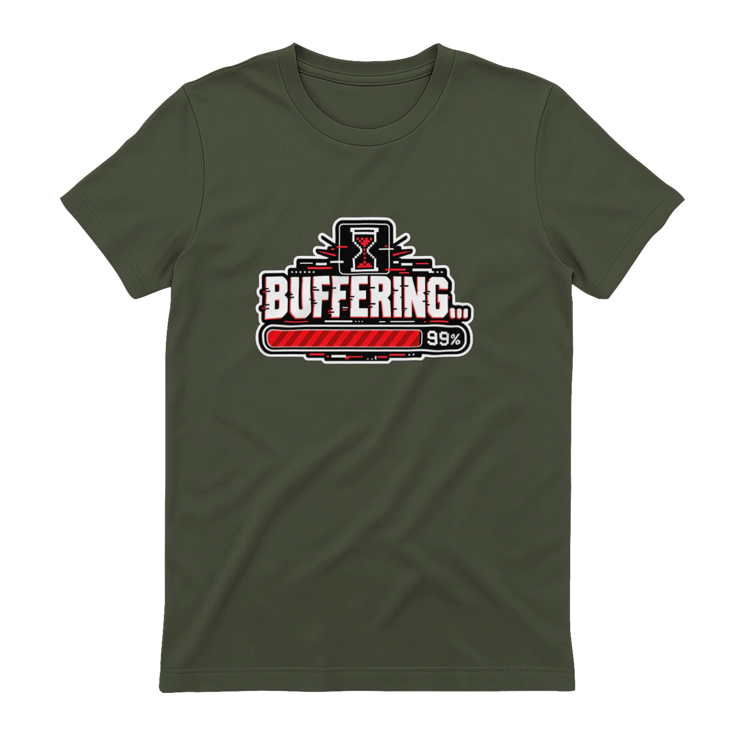
Buffering… 99%
A bold buffering design for anyone who has spent far too long staring at a progress bar stuck at 99%. With retro loading-screen energy and digital frustration turned into a joke, it’s a perfect fit for streamers, gamers, tech fans, and chronically impatient internet users.
Artlist
Music, footage and creative assets for video-first creators.