
Mode breakdown
Why this workflow is built around a handoff
Darrel Wilson’s tutorial is best understood as a rejection of the “one big prompt and hope for the best” approach to AI website building. His method starts with a simple problem: if you ask an AI to create a site in one shot, you often spend too much time fighting over layout details that are easier to show than describe.
The practical answer in the video is to split the work into stages. ChatGPT first creates a detailed screenshot-style design reference. Claude then reads that reference, expands it into a site, and fills in the rest of the pages. After that, the project is exported as HTML and pushed to hosting. The benefit is not just speed. It is that the creator can make visual decisions earlier, before the site becomes a pile of disconnected text instructions.
ChatGPT sets the visual direction first
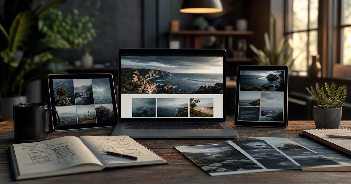
Wilson begins in ChatGPT by asking for a detailed website mockup rather than a finished site. That matters because the mockup becomes a visual brief. Instead of trying to explain every section, font choice, spacing decision, or content block in words, he uses the image as a stand-in for all of those choices.
The video shows him generating a design for a real estate company with a specific palette, cinematic imagery, and editorial typography. He also notes that the prompt can be adapted to fit a different business or brand. That is the real value here: the prompt is not treated as sacred copy. It is a starting structure that can be swapped around for different clients, industries, or aesthetic preferences.
He then uses ChatGPT again to generate the high-resolution images for the site and separates them when the files get too large. That step is easy to overlook, but it is one of the more useful parts of the workflow. If the site design depends on strong imagery, the layout alone is not enough. Wilson is effectively building the visual asset package before asking Claude to assemble the page.
Claude turns the reference into a working site
Once the screenshot and image files are ready, Wilson moves into Claude Design. Here, the job changes. ChatGPT provided the look; Claude has to interpret that look and build a site around it.
He attaches the screenshot, includes the image archives, and tells Claude to analyze the design and convert it into a standard prompt in website. He also switches to the strongest model setting he can find and uses maximum effort, while turning off design system support so it does not interfere with the original look. The editorial lesson is straightforward: when the goal is to preserve a specific visual direction, the setup matters as much as the prompt.
Claude produces a homepage that follows the screenshot closely and swaps in the supplied images. Wilson then pushes the workflow further by asking for additional pages: about, services, properties, agents, and contact. He also removes the blog page because it is not needed. That is where the process becomes more than a demo. It shows Claude being used not only to imitate a design, but to extend it into a site structure with multiple page types.
For readers thinking about their own workflow, this is the main takeaway: the AI is not just generating a landing page. It is being used as a layout translator. The screenshot sets the visual rules, and Claude applies those rules across new sections and pages.
What still needs human cleanup
Wilson does not present the generated site as finished without edits. In fact, some of the most useful moments in the video come when he points out what still needs cleanup.
The content has to be adapted to the actual business: address, phone number, email, social links, and SEO-related copy all need to be updated. Wilson shows how he can paste in business information and ask Claude to apply it across the site. That is a good example of where AI saves time without replacing review. The structure is there, but the business details still have to be checked and filled in carefully.
He also revisits the hero area and asks for subtle animation, which Claude adds as small particles in the background. Wilson is clear that he does not want anything too dramatic. That restraint is worth noting. A lot of AI web design demos overcomplicate the finishing touches. Here, the animation is used sparingly to make the site feel more premium, not to distract from the layout.
The broader editorial point is that AI does not remove the editing stage. It changes what the editing stage looks like. Instead of designing every component by hand, Wilson is refining an AI draft and deciding what deserves adjustment.
Exporting the site and putting it on a host
After the site is assembled, the final step is deployment. Wilson exports the project as standalone HTML from Claude, then uploads it into Hostinger through the file manager. He deletes the default file, places in the exported HTML, and renames it to index.html so the site will load properly.
That part of the tutorial is practical because it closes the gap between “I generated a nice-looking page” and “I have a site online.” The workflow is not limited to design exploration. It reaches the point where the build can actually be hosted.
Wilson also walks through choosing a hosting plan, using a temporary domain if needed, and moving through the dashboard to finish setup. The important editorial distinction here is that hosting is presented as part of the workflow, not a separate marketing pitch. The site does not become useful until it is deployed, and the tutorial treats that as the last required step.
For creators, freelancers, and small agencies, that makes the method more interesting than a simple AI demo. It shows a path from concept to site to published HTML without requiring a traditional build process at every stage.
What this method is really good for
The strongest use case for Wilson’s approach is speed with structure. If you already know the kind of site you want, but do not want to explain every component from zero, the screenshot-first workflow gives you a clearer starting point. It is especially useful when the design has to feel visually coherent across multiple pages.
It is less useful if you want AI to make all the creative decisions for you. Wilson’s process still depends on judgment: choosing the right mockup, selecting the best images, deciding which pages matter, and cleaning up the business information before launch. That is the real tradeoff. The workflow saves time, but only if you are willing to steer it.
For anyone comparing AI website tools, that is probably the most grounded way to read the video. Claude is not replacing design thinking here. It is compressing the boring middle of the process so the creator can move from idea to usable site faster.
Recommended next
Products & tools
One Mode Digital Media product and one relevant affiliate recommendation selected for this page.
Creator Mode: On
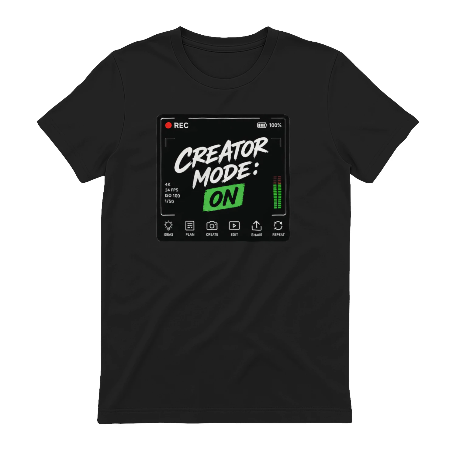
A creator-workflow design that flips the switch from everyday life to making something. “Creator Mode: On” combines camera HUD details, editing tools, and production icons for video creators, photographers, podcasters, streamers, and designers.
Hostinger
Hosting and website infrastructure for creators and small teams.