
Mode breakdown
Why this build is worth paying attention to
Bart Slodyczka’s brewery demo is useful because it does not treat AI website building like a magic trick. The video shows a more realistic process: start with a concept, ask the model to structure the page, generate the visuals needed to support the concept, then revisit the design after the first draft is live. That is the real story here.
The site itself is built around a drone-style hero section that flies through a fictional brewery, moving from the bar entrance to copper pipes, barrels, bottling, and then back out to reveal the whole space. Around that centerpiece, Claude Opus 5.5 assembles product sections, a booking flow, and supporting content. The result is less about perfect automation and more about how a strong visual idea can anchor the rest of a site.
For readers trying to understand what Claude Opus 5.5 website tutorial really means in practice, the answer is simple: the model can do a lot of the structural work, but the page gets better when the creator keeps directing it.
The workflow starts with a story, not a blank page
Slodyczka begins by defining the experience he wants the site to communicate. This is not just “make me a brewery website.” It is a brewery website built around motion, point of view, and a journey through the space. That matters because the site’s layout is driven by the media concept. The page is designed to support the drone flight, not the other way around.
He uses Claude Code with an Opus 5.5 project, and he pairs it with Higgsfield so the system can generate the images and videos needed for the experience. In the setup, the desktop version is treated as the main build, while a second prompt handles the mobile refinement. That separation is a smart move. It keeps the first pass focused on composition and the second pass on fitting the content to smaller screens.
The visual brief is also specific. The brewery scenes are described in sequence: front bar, steam, barrels, bottling line, then a reveal from the back of the building. That kind of direction matters more than vague aesthetic requests. The model is not just guessing at the vibe; it is being asked to build around a camera path and a narrative arc.
The other useful choice is that he keeps the project fictional. That gives the model room to create the logo, copy, and labels from scratch without being constrained by a preexisting brand system. For a tutorial, that makes the process easier to follow. For a real business, the lesson is to bring your own assets when you can, but still give the model a story it can organize around.
The most interesting part is the stitched drone sequence
The hero section is the piece that gives the whole page its identity. Instead of relying on a static header image, Slodyczka builds a moving fly-through that passes from one scene into the next. He explains that the clips are designed to fuse together, with the end frame of one scene becoming the start frame of the next.
That is the strongest idea in the whole tutorial. It makes the site feel designed around continuity rather than a pile of disconnected visuals. It also helps the page work as a guided experience. The visitor is not just scrolling past sections; they are moving through a place.
He also notes that the flight path should feel slightly dynamic, not like a straight hallway camera. The drone sways left and right, pans through rooms, and reveals the wider brewery at the end. That gives the motion a little life. It also introduces one of the practical tradeoffs in AI-generated video: the transitions can be impressive, but they can also create small continuity errors, like objects disappearing or a person appearing where the previous frame did not show them.
Rather than pretending those issues do not exist, the video treats them as part of the editing process. The first render is useful, but it is not sacred. That approach makes the workflow feel more realistic for anyone trying to use AI media in a real web build.
The first desktop version shows both the strengths and the limits
Once the desktop site is assembled, the best parts are easy to see. The hero has energy. Hover states add movement. One section uses stacked cards to keep the page from feeling flat. The booking form fits the brewery concept instead of feeling pasted on. Even the generated bottle labels help the site feel more complete than a plain text-and-button page would.
But Slodyczka is also honest about what does not fit. Some sections feel too loud for the building’s overall look. A yellow strip across one transition makes the page feel cheaper than the rest of the design. Another section pushes the tone too far into promo-style territory, which clashes with the more atmospheric brewery aesthetic. He trims those parts back.
That editing pass is one of the most useful moments in the tutorial. It shows that a model can generate a lot of material, but taste still matters. The job is not finished when the page appears in the browser. The job is finished when the parts agree with each other.
This is also where the video answers a common question: can one prompt produce a polished site? Sometimes it can produce a promising site, but not a finished one. The result still needs human filtering, especially when the design has to match a specific mood.
Why the mobile pass matters as much as the first build
The mobile refinement is not treated as an afterthought, and that is the right call. Slodyczka points out that the drone footage scales surprisingly well on smaller screens because the camera already has a clear point of view. That means the same media can carry over without needing a totally different concept for mobile.
At the same time, mobile exposes the weak spots in the layout. Some elements fall off screen. Some sections need to be tightened up so they read cleanly in a narrower viewport. The second prompt exists for exactly that reason: the page needs to be reorganized so the experience still works when the screen shrinks.
The best mobile outcome in the video is the booking form, which fits into a single viewport and stays usable without awkward scrolling. The navigation also behaves well once the site shifts from the transparent menu used in the hero to a more solid version later on. Those are small details, but they are the kinds of details that decide whether a concept feels like a demo or like a site someone could actually use.
What this tutorial suggests about AI site building now
The main takeaway from Slodyczka’s video is not that Claude Opus 5.5 can replace the design process. It is that AI can make the process more iterative if the creator is willing to steer it.
A practical workflow emerges here:
- define the story first
- keep the media concept tied to that story
- let the model draft the structure
- review the page in context
- cut anything that breaks the tone
- test the mobile version as a separate step
That sequence matters because it keeps the build from collapsing into random visual output. The model can generate the parts. The creator decides which parts belong together.
If you are looking at this as a no-code website build, the real value is in the combination of media generation, layout planning, and refinement. The brewery demo is strong because each step feeds the next one. The video does not oversell the process, and that makes it more useful than a purely polished showcase.
Recommended next
Products & tools
One Mode Digital Media product and one relevant affiliate recommendation selected for this page.
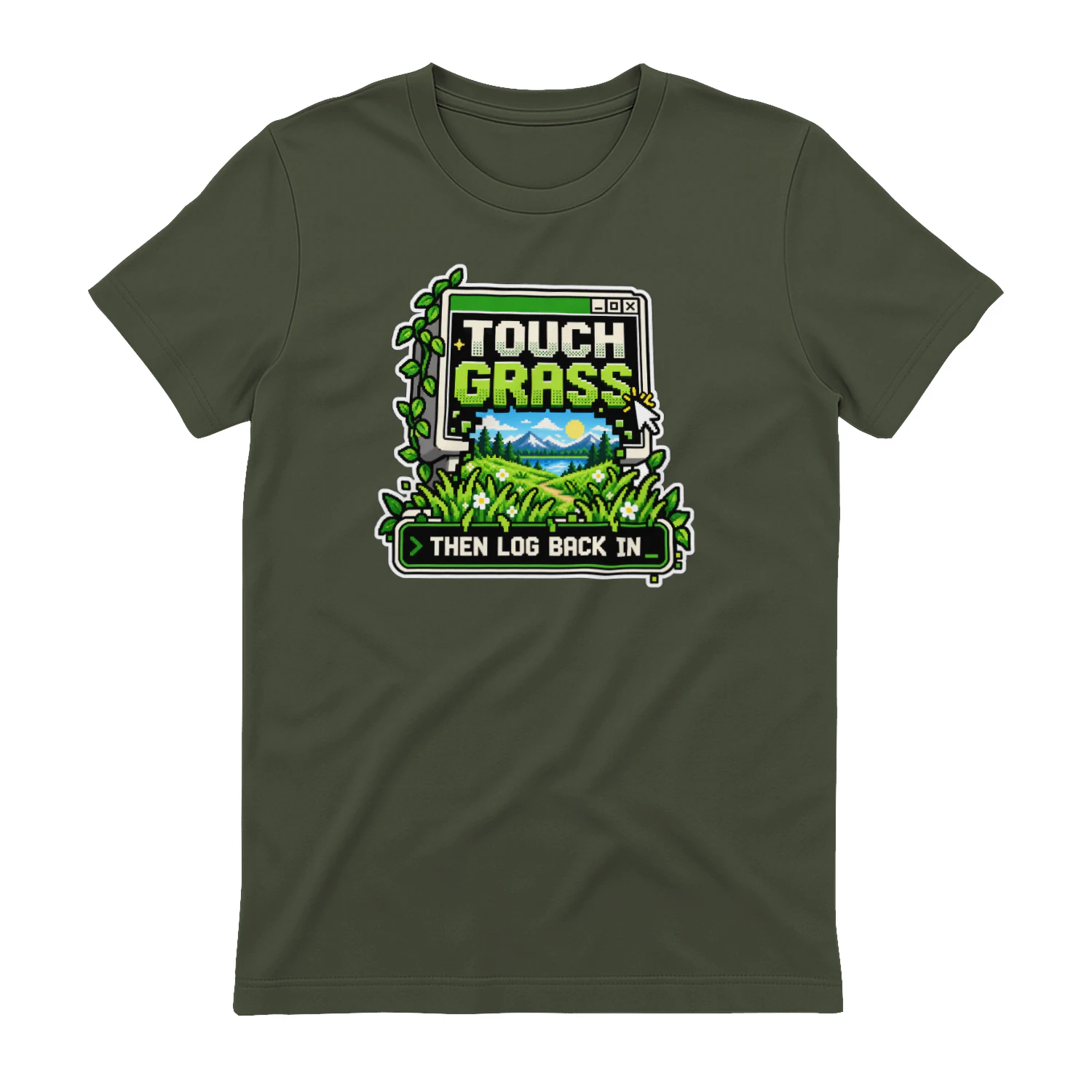
Touch Grass — Then Log Back In
A playful digital-life design for anyone who knows the internet is better after a little fresh air. “Touch Grass — Then Log Back In” blends retro computer style with outdoor scenery for creators, gamers, tech fans, and anyone trying to balance screen time with real life.
LearnWorlds
Course-building and learning-platform tools for creators and businesses selling education online.