
Mode breakdown
What God's Eye View actually is
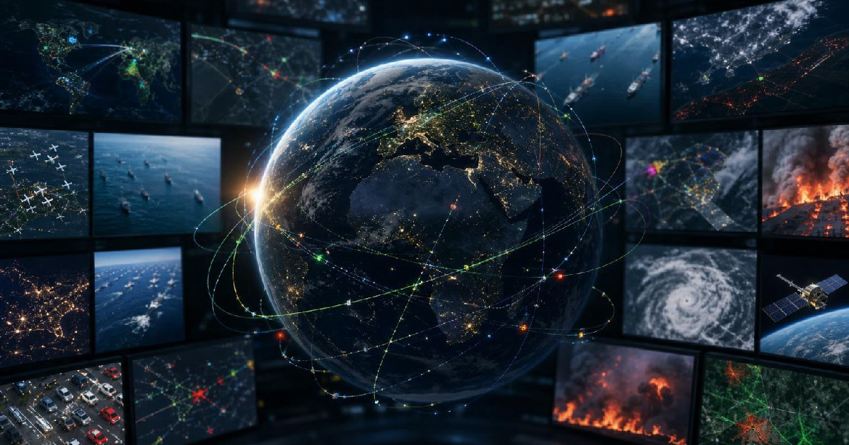
God’s Eye View, the open-source project Bilawal Sidhu walks through with Matt Wolfe, is best understood as a browser-based globe that pulls together public and semi-public data layers into one spatial interface. The video’s direct answer is simple: it is not a fantasy dashboard and it is not built to track people. It is a way to see the world’s physical systems in one place, using the same style of command-center visualization that Hollywood has made familiar, but grounded in real feeds.
That framing matters because the appeal is not just visual. The project solves a very practical problem: useful world data is usually scattered across separate services, each with its own interface, assumptions, and level of accessibility. God’s Eye View tries to reduce that fragmentation. Instead of switching between maps, trackers, camera portals, and event pages, users can move across a single globe and inspect what is happening in a region from several angles at once.
Wolfe presents the tool as something people can use for content, local awareness, journalism, activism, and, in more specialized settings, defense-related analysis. Sidhu, for his part, keeps the project grounded in civilian intelligence: information that is already public, just not always easy to connect.
The data layers that make it feel alive
The strongest reason the project stands out is not that it shows one category of information well. It is that it keeps stacking categories until the globe starts to feel active instead of static. Sidhu and Wolfe move through flights, military flights, satellites, vessels, traffic, public CCTV, earthquakes, NASA fire detections, submarine cables, data centers, and even mapped installations. Each layer changes the kind of question you can ask.
A flight layer gives you a moving picture of air traffic, while the military layer introduces a different level of uncertainty because not every aircraft is identified in the same way. Vessel data pushes the experience from the sky to the water. Traffic layers add live road density and direction. CCTV layers show publicly accessible city cameras, but with delay and privacy boundaries built in. Fires from NASA FIRMS add a planetary layer that makes hot spots visible in a way most users would never see from a standard map app.
The value here is not novelty for its own sake. It is context. Wolfe keeps asking the kinds of questions a curious user would ask in a city, at an airport, or during a breaking event: what else is near this location, what is moving around it, what does the surrounding infrastructure look like, what other signals support the picture?
That is where the tool’s design feels different from a normal mapping app. The globe is not only for finding a place. It is for interpreting a place.
How Bilawal Sidhu built it with AI
Sidhu’s build process is one of the most useful parts of the conversation because it shows the difference between having AI tools and actually using them to assemble a working product. He describes the initial build in March and April as a mix of AI-assisted development tools and model strengths he could combine: one model for spatial reasoning, another for full-stack help, and a lot of iterative work to bring the pieces together.
That is a more realistic picture of AI-assisted building than the usual shortcut myth. The project did not appear because a model magically produced a polished app in one pass. Sidhu had to know which APIs existed, how to connect them, and how to layer features in a way that kept the experience usable. Wolfe makes that point implicitly by pushing on the build process rather than treating the interface as if it emerged by accident.
The result is an app that can be navigated with voice commands and contextual prompts. In the video, that means you can ask it to jump to a city, inspect a flight, or pull in surrounding information. The tool can answer questions about the data it is showing, which makes it feel less like a passive map and more like an interactive analyst.
Privacy limits, costs, and what it will not do
This is the part of the video that keeps the project from being reduced to a spy fantasy. Sidhu is explicit that the open-source version draws a hard line against tracking people. It is designed to show large-scale infrastructure and public systems, not individual movement.
Wolfe reinforces that boundary when he talks through the layers on screen. Public CCTV is delayed. Traffic is anonymized. The app may show where a camera is pointed or how busy a road segment is, but it is not built to expose license plates or follow a person through town. That distinction gives the tool its public-facing legitimacy and helps explain why Sidhu keeps describing it as civilian intelligence rather than surveillance.
There is also a practical cost discussion. Sidhu says the open-source version is intended to stay accessible, and that for personal non-commercial use, most people can use it at little or no cost unless they rely on the voice interaction features or run the tool heavily. In other words, the barrier is not just price. It is also the user’s willingness to set up the necessary keys and accept that some richer features depend on outside services.
That tradeoff is worth keeping in mind because it defines the project’s audience. This is not a casual consumer app meant to hide all its complexity. It is a powerful interface for people who want to explore the real world through data, and who are comfortable setting up the plumbing behind it.
How to try it yourself
Wolfe’s installation walkthrough is intentionally practical. Rather than treating setup as a separate technical deep dive, he frames it as a quick path for users who want the same experience on their own machines. He uses a local project setup, points an AI coding app at the GitHub repository, and asks it to clone the repo, read the instructions, install dependencies, and surface the remaining steps.
That workflow is part of the story because it reflects how these tools are increasingly being deployed: not by hand-assembling every dependency, but by letting an agent handle the mechanical parts once the instructions are clear. Wolfe then shows the payoff after the API keys are added. The globe becomes immediately more useful once the data sources are active, and the whole point of the setup sequence is to get from empty interface to live layers as quickly as possible.
For readers, the practical lesson is this: if you are curious about the project, think of it as a layered research surface rather than a novelty map. It can help you understand flights, ports, public cameras, fires, earthquakes, and infrastructure in a way that standard consumer maps do not. It can also show why public data becomes more meaningful when it is arranged spatially instead of left in separate dashboards.
Why the video lands beyond the novelty
The reason Matt Wolfe’s conversation works is that it gives the project a clearer identity than the title alone suggests. Yes, God’s Eye View looks like a spy tool. Yes, it can be playful, even a little absurd, especially when you use voice to pull the camera around a globe and ask it to explain what you are seeing. But the stronger point is that Sidhu is building a public interface for context.
That matters in a media environment where information often arrives as isolated clips, single maps, or noisy social posts. God’s Eye View tries to connect the dots without pretending it can replace judgment. It is a tool for looking, but also for comparing layers and asking better questions.
And that may be the most useful takeaway from the video: the exciting part is not that the globe feels like a command center. It is that real-world data becomes easier to read when it is given a shared spatial home.
Recommended next
Products & tools
One Mode Digital Media product and one relevant affiliate recommendation selected for this page.
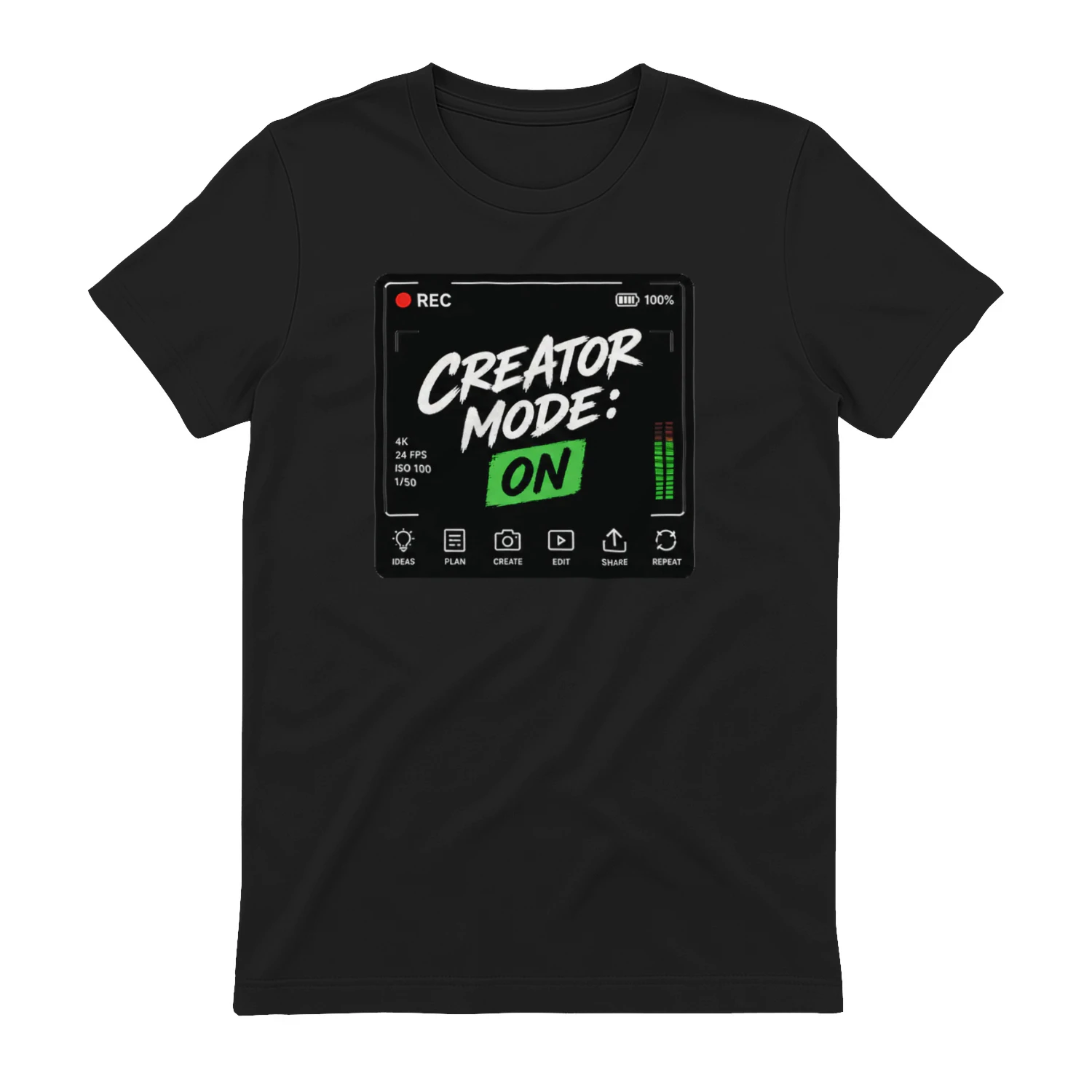
Creator Mode: On
A creator-workflow design that flips the switch from everyday life to making something. “Creator Mode: On” combines camera HUD details, editing tools, and production icons for video creators, photographers, podcasters, streamers, and designers.
Cerri
Project and work-management software for teams that need clearer planning, ownership and delivery workflows.