
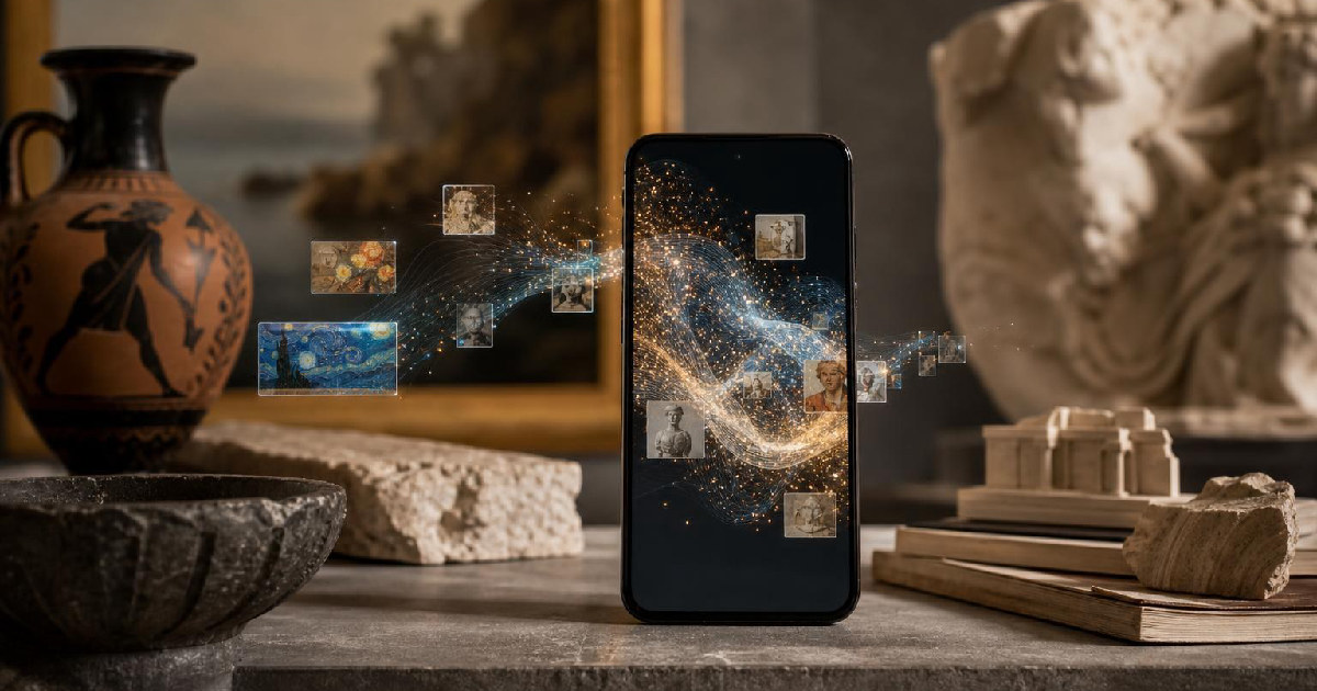
Google Arts & Culture has spent years trying to make museums, artworks, and cultural collections feel less distant on a phone screen. Its app redesign follows that same logic: organize the experience around discovery, surface more personalized entry points, and make room for playful AI tools without turning the whole product into a gimmick. The result is a clearer picture of what Google wants the app to be now: not just a reference archive, but a browsing space that rewards curiosity.
The practical question for users is simple: what changed, and what is actually worth using? The strongest answer comes from the app structure itself. Google says the redesigned mobile app was built around Explore, Inspire, and Play, with a stronger emphasis on partner collections, personal recommendations, and interactive experiments. That design choice matters because it moves the product away from a single search-style interface and toward distinct modes for different kinds of cultural curiosity. For someone who wants to skim, the feed is there. For someone who wants to go deeper, the collection browsing is there. For someone who wants a hands-on experience, the experiments are there.
A redesign built around different kinds of curiosity
The main change in the August 2023 redesign announcement is not one dramatic feature but the way the app is organized. Google says the updated app lets people browse artifacts, cultural stories, partner collections, and more, then refine exploration by place, topic, and creator. That is a useful shift for a product with a large and varied library: it gives the app more than one entry point.
The Explore area is the most straightforward of the three. It is meant for broad browsing across cultural topics such as art, food, fashion, craft, and science. That breadth is part of the appeal. A user who arrives for art can move into related material without needing to know exactly what to search for next. Google also points to contributions from more than 3,000 partner collections, which helps explain why the app can support such wide-ranging browsing in the first place. The scale of the archive is important, but the better user story is the structure: it is designed so the volume feels navigable.
The personalized feed is the app’s quietest but most practical feature
Google’s Inspire feed is easy to overlook because it is not the flashiest part of the redesign. It may also be the most immediately useful for casual users. Google describes it as an always-changing, personalized stream of cultural highlights that can be swiped through like a daily cultural digest. It includes artifacts, cultural stories, events, and more across different topics, and it learns from what users favorite.
That makes Inspire function less like a destination and more like a habit. The feed is there for the person who does not want to plan an exploration session but still wants regular exposure to new material. It also gives the app a lightweight reason to return, which is important for a reference product that could otherwise become something people open only when they already know what they want.
Google later made the personalization story even more explicit with Culture Weekly, described as a weekly delivery of cultural content based on selected interests. Users first choose from 12 topics including visual arts, fashion, history, music, and food, then receive a tailored package once a week. For readers deciding whether this is a serious learning tool or a novelty, the practical appeal is that it keeps the app’s promise of lightweight discovery while reducing the burden of active searching.
AI is being used as a discovery layer, not just a novelty
Google Arts & Culture has also leaned into AI-powered experiences as part of the app’s broader identity. The company has highlighted features including Poem Postcards, Art Transfer 2, Art Zoom Out, and Culture Weekly and has continued to expand that approach with newer tools.
Among those, Art Transfer 2 is the clearest example of AI serving a learning function. Google says users can snap or upload a photo and transform it using one of 12 art-inspired styles. The key point is not simply that the image changes. Google says its AI models then analyze the result and explain how it reflects the chosen style, including elements like brushwork, color palettes, and composition, with options to find related artworks and artists on the platform. That combination turns a creative filter into a guided art-history prompt.
Art Zoom Out takes a similar approach from the opposite direction. Instead of transforming a user’s photo, it uses generative AI to imagine what might lie beyond the frame of an artwork. The feature plays with context, which is often the missing piece when art is viewed on a phone. Even if the output is speculative, the experience nudges users to think about framing, composition, and what is excluded from the visible image.
Conversational search changes how the app can be used
The newest AI layer in the available evidence is Art Chat, which Google describes as enabling real-time conversations about artworks. That is a meaningful shift because it changes the user’s role from passive viewer to questioner. Instead of scrolling through explanations, a user can ask why a sky swirls in a painting or why a scene feels emotionally charged, then get an answer without leaving the explainer video.
This matters for a product like Google Arts & Culture because the app already has a lot of material that can feel rich but overwhelming. Conversational features can lower the friction between curiosity and context. The important limitation is that this is still a guided experience inside Google’s own ecosystem of artworks and explainers. It is not a replacement for scholarly interpretation, but it does offer a faster route into the material for users who want immediate context.
What to try first, depending on your goal
For users who want the app to function as a browsing tool, start with Explore and use the filters for place, topic, and creator. That is the most direct way to test whether the redesign actually makes the collection easier to navigate.
For users who want a low-effort way to keep up with cultural material, Inspire and Culture Weekly are the clearest fit. Both are built around personalization, but in different rhythms: one is continuous, the other weekly.
For users who want the app to feel playful, Play is where the most distinctive experiments live. Google says that tab includes camera tools like Art Selfie and Art Filter, games and toys such as Blob Opera and Viola the Bird, and experiments like Poem Postcards. Poem Postcards, in particular, shows how Google wants to connect art appreciation with creative output: users select an artwork, choose a poetic form such as a sonnet, haiku, or limerick, and generate an AI-written postcard they can share.
Recommended next
Products & tools
One Mode Digital Media product and one relevant affiliate recommendation selected for this page.

Currently Avoiding a Software Update
A minimalist system-alert design for anyone who has clicked “Remind Me Later” more times than they can count. “Currently Avoiding a Software Update” turns a universal tech habit into clean, wearable humor for computer users, creators, and professional procrastinators.
Artlist
Music, footage and creative assets for video-first creators.
Original source
Mode adds independent editorial context while preserving a clear path to the original source behind this story.
View original source ↗